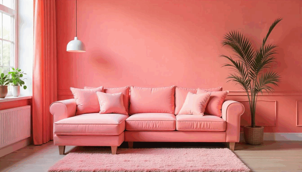
Here’s the thing about pink living rooms: everyone’s either obsessed or terrified. I’ve designed dozens of pink spaces over the past eight years, and I can tell you that 90% of people get it completely wrong. They either go full cotton-candy nightmare or chicken out with barely-there blush that disappears under normal lighting.
Pink isn’t just a color—it’s a mood. When done right, it creates the most sophisticated, cozy spaces you’ve ever experienced. I’m talking about rooms that make your guests linger longer and your family actually want to hang out together instead of hiding in their bedrooms.
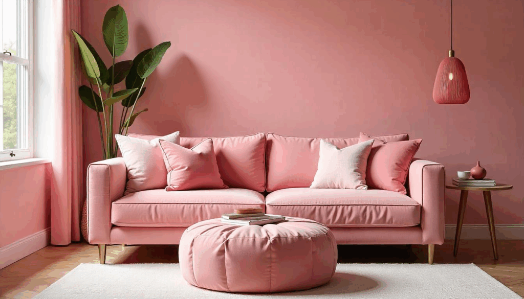
1. Start with Dusty Rose Walls for Instant Sophistication
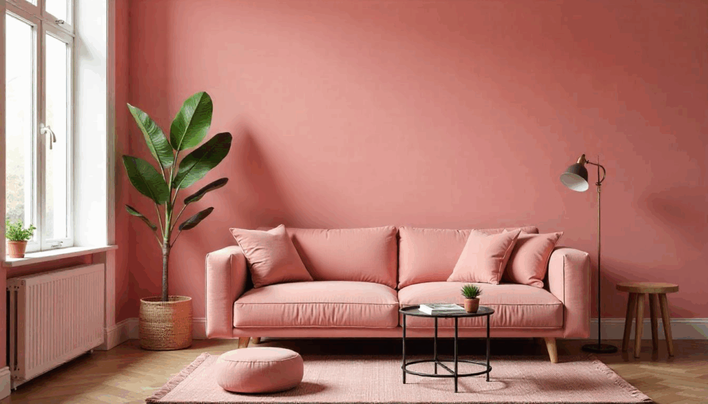
Forget millennial pink—dusty rose is where it’s at. This muted, earthy pink has enough gray undertones to feel grown-up while still being undeniably pink. I painted my own living room in Farrow & Ball’s Dead Salmon three years ago, and I still get compliments from visitors who can’t quite figure out why the room feels so calming.
The key is choosing a shade that looks different throughout the day. Morning light should make it feel fresh and airy, while evening lamplight brings out the deeper, cozier tones. Test your paint samples at different times—trust me on this one.
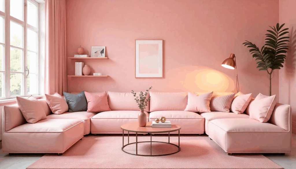
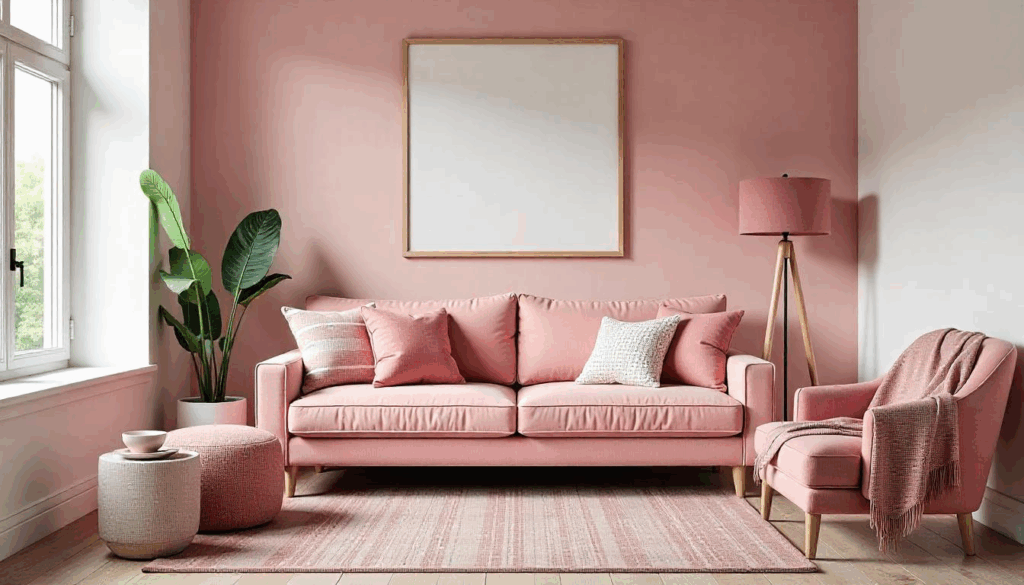
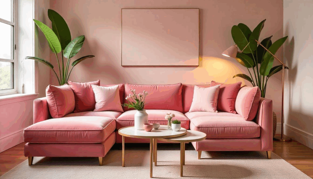
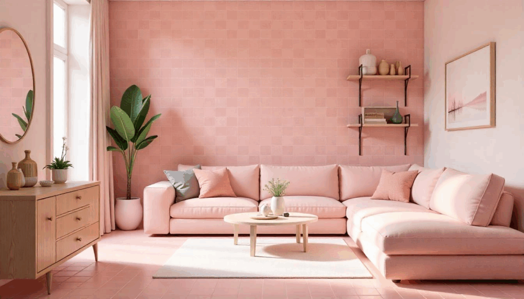
2. Layer Multiple Pink Tones Like a Pro Designer
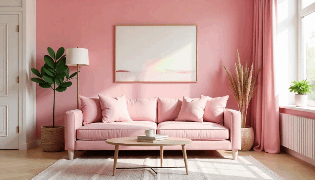
Single-shade pink rooms look flat and amateur. The secret is using at least three different pink tones: your main wall color, a deeper accent shade, and a lighter highlight color. I typically use the 60-30-10 rule here—60% main pink, 30% deeper accent, 10% lighter highlight.
Think salmon walls, mauve throw pillows, and pale rose artwork. The variation creates depth and prevents that one-note feeling that screams “I bought everything from the same Pinterest board.” Your eye needs places to rest and areas to explore.
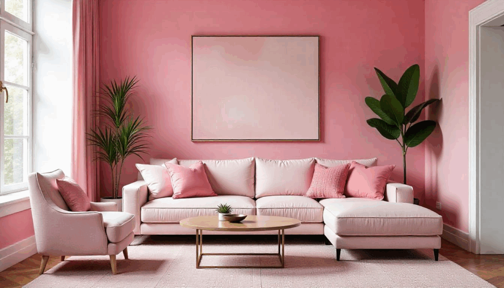
3. Anchor with Rich Navy Blue for Unexpected Drama
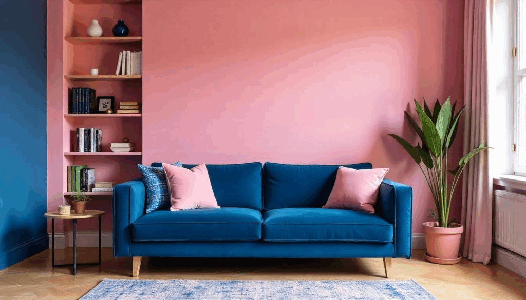
Pink and navy is the most underrated color combination in interior design. I discovered this combo by accident when a client’s navy sofa arrived the same day as her pink walls, and the result was absolutely stunning. The contrast is bold without being harsh.
Use navy as your grounding element—a velvet sofa, built-in bookshelves, or even just a large area rug. The deep blue makes the pink feel more intentional and sophisticated rather than accidental or juvenile. It’s the difference between looking designed versus decorated.
4. Mix Warm and Cool Pink Undertones for Complexity
Here’s something most people don’t realize: pink has undertones just like any other color. Cool pinks lean purple or blue, while warm pinks tend toward orange or yellow. Mixing both creates visual interest that keeps your room from feeling flat or one-dimensional.
I learned this the hard way when I painted a whole room in what I thought was the perfect pink, only to realize it looked completely different next to my coral throw pillows. Now I always test warm and cool pinks together before committing to anything permanent.
5. Use Blush Pink on Ceilings for Dreamy Ambiance
Painted ceilings are having a major moment, and blush pink creates the most gorgeous, soft glow overhead. It’s like having perfect Instagram lighting built into your room. I’ve done this in four different homes now, and it never fails to make the space feel more intimate and cozy.
The trick is going lighter than you think you need—what looks barely pink on the paint chip will read as distinctly pink on a large ceiling surface. Start with a 50% tint of your wall color and adjust from there. Your room will feel like it’s wrapped in a warm, rosy hug.
6. Incorporate Vintage Brass Hardware for Warmth
Pink and gold is classic, but brass brings more sophistication to the table. I’m talking about cabinet hardware, picture frames, side table legs, and lighting fixtures in warm, vintage brass tones. The slightly tarnished look prevents your room from feeling too precious or formal.
Modern brass works too, but there’s something about aged brass that makes pink feel more collected and curated rather than themed. I hunt for vintage brass pieces at estate sales—they have character that you just can’t buy new.
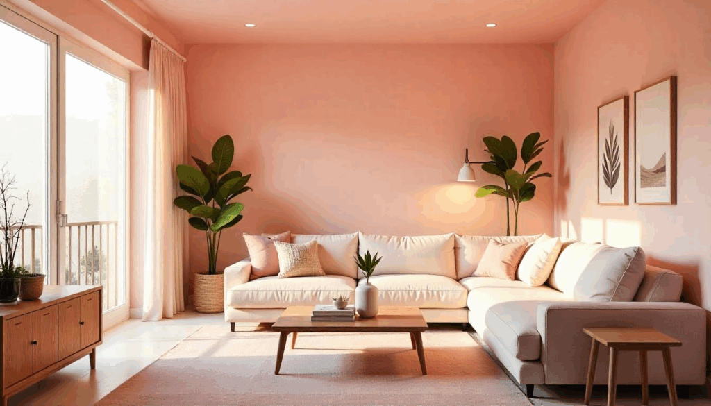
7. Add Forest Green Plants for Natural Balance
Living greenery is essential in pink rooms—it prevents the space from feeling too artificial or staged. I’m particularly obsessed with deep green plants like fiddle leaf figs, monstera deliciosa, or even just a collection of pothos in vintage brass planters.
The green-pink combination is naturally harmonious (hello, roses and leaves), but choose plants with deeper, richer green tones rather than bright lime greens. Forest greens feel more mature and create better contrast with pink walls.
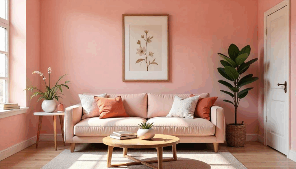
8. Choose Cream Over White for Softer Contrast
Pure white trim and furniture can look harsh against pink walls—it creates too much contrast and makes the room feel disconnected. Instead, opt for warm cream or off-white tones that complement the pink rather than competing with it.
I use Benjamin Moore’s Cloud White or Sherwin Williams’ Creamy in pink rooms, and the difference is remarkable. The space feels cohesive and intentional rather than like someone just slapped pink paint on standard white-trimmed walls.
9. Layer Textured Fabrics in Varying Pink Shades
Texture is absolutely crucial in monochromatic rooms. I mix linen, velvet, bouclé, and silk in different pink tones to create visual and tactile interest. A pink velvet sofa with linen throw pillows and a bouclé ottoman creates layers that prevent the room from feeling flat.
The key is varying both texture and shade intensity. Pair a deep rose velvet with pale pink linen, or mix matte and shiny textures like brushed cotton with silk. Your room should invite touching, not just looking.
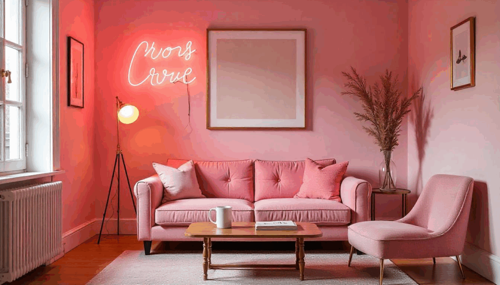
10. Install Pink-Toned Lighting for Evening Magic
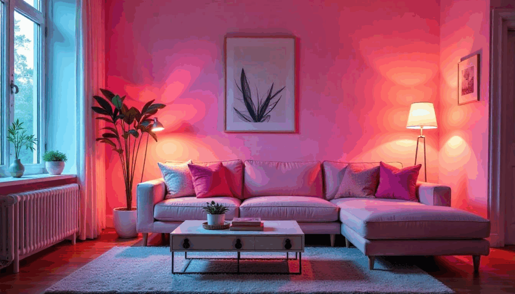
Regular white LED bulbs will kill the pink vibe faster than anything else. I always use warm white bulbs (2700K or lower) in pink rooms, and sometimes I’ll even add pink-tinted bulbs in accent lamps for extra ambiance in the evenings.
Philips Hue bulbs are perfect for this—you can adjust the color temperature throughout the day. Cooler light during daytime tasks, warmer and slightly pink-tinted light for evening relaxation. It’s like having professional lighting design at your fingertips.
11. Create a Gallery Wall with Warm-Toned Art
Pink walls are perfect for showcasing artwork, but choose pieces with warm undertones rather than cool ones. I gravitate toward vintage botanical prints, warm-toned abstract paintings, or photography with golden hour lighting.
Avoid anything too blue or purple-toned—it’ll clash with most pink wall colors. Instead, look for pieces with cream, gold, coral, or warm brown tones. Even black and white photography works better when it has warm, sepia undertones rather than stark contrast.
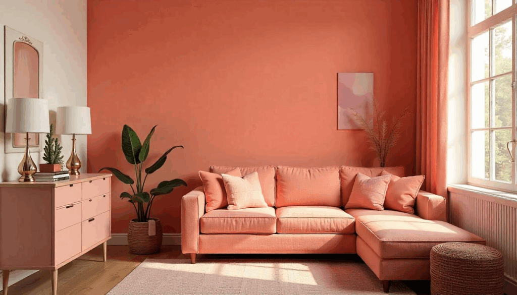
12. Mix Pink with Unexpected Earth Tones
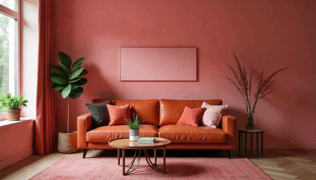
Pink doesn’t have to be paired with traditional feminine colors. Some of my favorite pink rooms incorporate terra cotta, rust, deep browns, and even charcoal gray. These earthy tones make pink feel more grounded and sophisticated.
I once designed a living room with salmon pink walls, a rust-colored leather sofa, and charcoal accents—it was masculine and cozy without being overly feminine. Don’t be afraid to push boundaries and challenge preconceptions about what pink can be.
13. Use Pink Marble or Stone for Luxury Touches
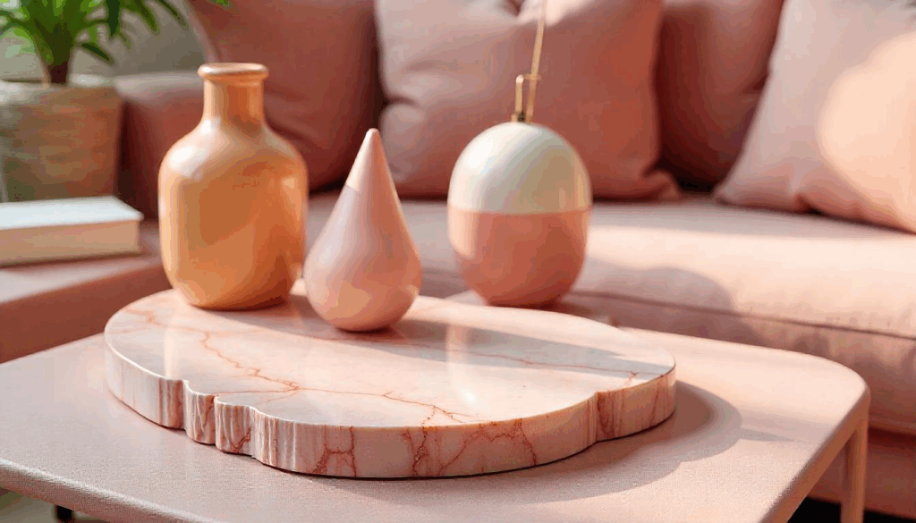
Natural stone in pink tones adds instant sophistication and prevents your room from feeling too artificial. Pink marble side tables, rose quartz bookends, or even just a pink-veined marble tray on your coffee table can elevate the entire space.
The natural variations in stone prevent the matchy-matchy look that can make pink rooms feel themed rather than designed. Plus, the cool temperature of stone provides a nice contrast to soft fabrics and warm lighting.
14. Balance with Dark Wood Furniture
Dark wood grounds pink rooms beautifully—walnut, mahogany, or even painted black wood furniture creates sophisticated contrast. I particularly love mid-century modern pieces in pink rooms because the clean lines prevent things from feeling too frilly or traditional.
The key is choosing furniture with simple, streamlined shapes rather than ornate details. Let the pink be the star while the dark wood provides structure and visual weight to anchor the space.
15. Add Metallic Accents in Rose Gold or Copper
While brass is my go-to, rose gold and copper metallics create gorgeous tonal harmony in pink rooms. These warmer metals enhance the pink rather than competing with it, especially in lighting fixtures, picture frames, and decorative objects.
I’m particularly fond of copper pendant lights over a pink kitchen island or rose gold picture frames in a pink powder room. The key is being consistent—pick one metallic tone and stick with it throughout the space.
16. Incorporate Vintage or Antique Elements
Pink rooms can feel too new or temporary without some vintage elements to ground them. I always include at least one genuine antique piece—a vintage mirror, an old wooden chest, or grandmother’s china cabinet painted in a coordinating color.
These pieces add story and character that prevents your room from looking like a magazine spread. They suggest the room has evolved over time rather than being decorated all at once, which feels more authentic and lived-in.
17. Use Pink in Unexpected Places Like Built-ins
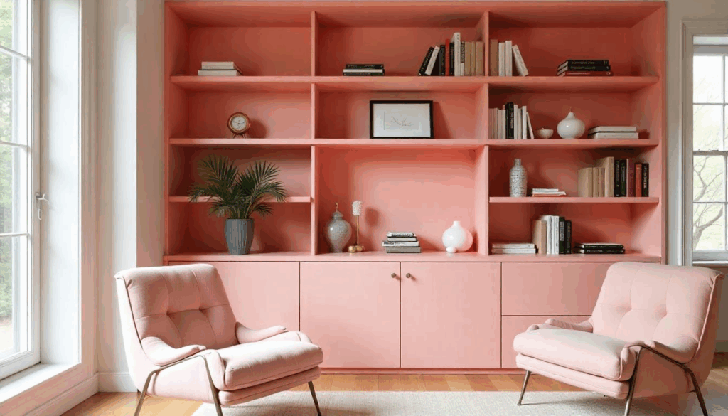
Instead of painting all your walls pink, consider using the color in built-in bookcases, the interior of an armoire, or inside floating shelves. This creates pops of color that feel intentional and sophisticated rather than overwhelming.
I painted the inside of a client’s built-in bookcase in a deep rose color while keeping the walls neutral, and it became the most photographed element in her home. The books and decorative objects looked incredible against the pink backdrop.
18. Layer Patterns Carefully in Pink Tones
Mixing patterns in a pink room requires a light touch, but when done right, it adds incredible visual interest. I typically stick to two patterns maximum—perhaps a floral area rug with striped throw pillows, or geometric wallpaper with solid fabrics.
The key is varying the scale of patterns and keeping them in similar color families. A large-scale pink floral with small-scale pink gingham can work beautifully, but throw in a third pattern and things get chaotic quickly.
19. Create Focal Points with Deep Pink Accents
Not every pink in your room needs to be the same intensity. Use deeper, more saturated pink in small doses as focal points—a single accent wall, a statement piece of furniture, or large artwork. This creates visual hierarchy and prevents monotony.
I often use what I call the “lipstick strategy”—one bold pink element that draws the eye, surrounded by softer, more neutral pink tones. It’s like wearing a bold lipstick with otherwise natural makeup—impactful but not overwhelming.
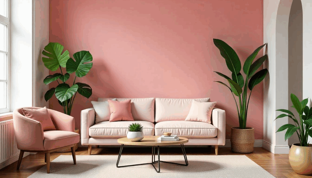
20. Include Natural Materials for Organic Balance
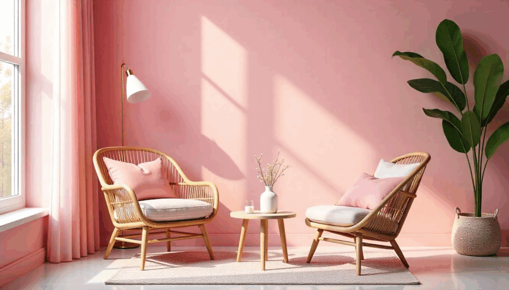
Pink rooms need natural elements to feel grounded rather than artificial. Incorporate materials like rattan, jute, linen, and unfinished wood to add texture and organic shapes that contrast with the potentially sweet nature of pink.
A rattan chair in a pink room feels fresh and modern rather than stuffy or overly feminine. These natural materials add visual weight and authenticity that prevents the space from feeling like a showroom.
21. Design Pink Ombré Walls for Visual Drama
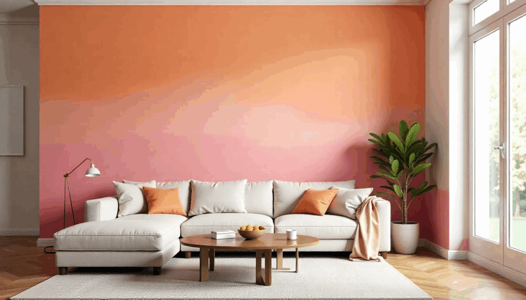
For the truly adventurous, consider an ombré wall treatment that transitions from deep pink at the bottom to pale pink or cream at the top. This technique adds architectural interest and makes ceilings appear higher while creating a custom, designer look.
I’ve done this technique twice, and both times it became the talking point of the entire home. The key is blending the colors while the paint is still wet, which requires working quickly and having help—definitely not a weekend DIY project.
22. Use Pink Velvet for Ultimate Luxury
Nothing says luxury like pink velvet upholstery. A pink velvet sofa or armchair becomes an instant statement piece that elevates the entire room. The texture catches light beautifully and feels incredibly sophisticated when paired with the right accessories.
Choose deeper pink velvets rather than pale ones—they show wear less and feel more intentional. I’m currently obsessed with a dusty rose velvet sectional I installed last month; it photographs like a dream and feels even better to sink into.
23. Add Pink Through Large-Scale Artwork
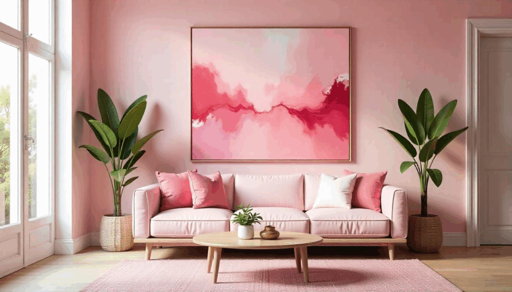
If you’re nervous about committing to pink walls, start with a large-scale piece of pink artwork. A massive abstract painting or photograph with pink tones can anchor the entire room’s color scheme without permanent commitment.
I often use oversized pink artwork as the jumping-off point for entire room designs. Choose something with multiple tones and colors so you can pull accent colors for the rest of the space—it’s like having a built-in color palette.
24. Create Contrast with Black Accents
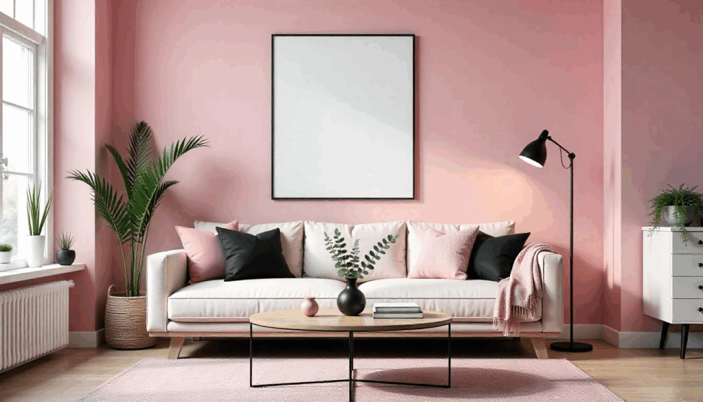
Pink and black is a timeless combination that feels both classic and modern. Use black sparingly as accent elements—picture frames, lamp bases, or decorative objects—to add sophistication and prevent the room from feeling too sweet.
The contrast is striking without being harsh, and black helps define spaces and add visual weight. I particularly love black picture frames with pink walls—it makes both the artwork and the wall color look more intentional and curated.
25. Incorporate Pink Through Window Treatments
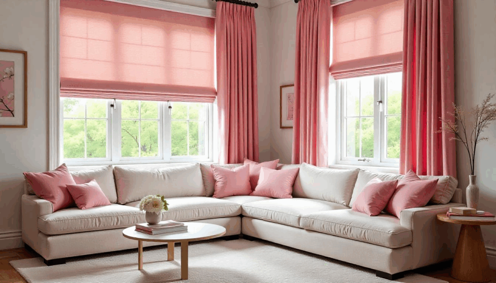
Pink curtains or roman shades can transform a neutral room into a pink paradise without painting a single wall. Choose fabrics with interesting textures or subtle patterns to add visual interest while controlling the amount of pink in the space.
Floor-to-ceiling pink curtains make windows appear larger and add drama to any room. I prefer linen or cotton fabrics over silk—they feel more relaxed and less formal while still being sophisticated.
26. Use Pink Tile for Permanent Elegance
Pink tile might sound retro, but modern pink tiles are incredibly sophisticated. Consider pink subway tile backsplashes, pink marble floor tiles, or even pink zellige tiles for texture and permanent color that won’t need refreshing in a few years.
The key is choosing tiles with natural variation rather than solid, uniform pink. Handmade tiles with slight color variations feel more luxurious and authentic than perfectly uniform machine-made versions.
27. Mix Pink with Other Warm Neutrals
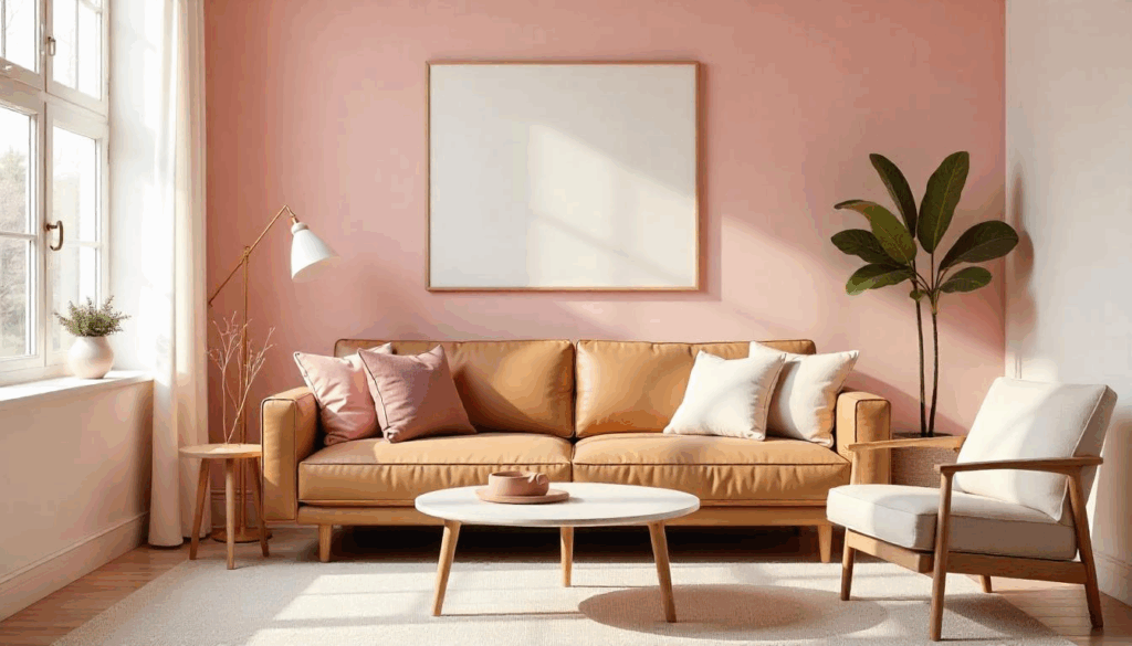
Pink plays beautifully with warm neutrals like camel, taupe, cream, and warm gray. This combination feels sophisticated and grown-up while still incorporating the warmth and femininity that makes pink so appealing.
I designed a whole living room around this palette last year—pink walls with a camel leather sofa and cream accents—and it’s still one of my favorite projects. The room feels cozy and welcoming without being overly feminine or juvenile.
28. Add Pink Through Decorative Lighting
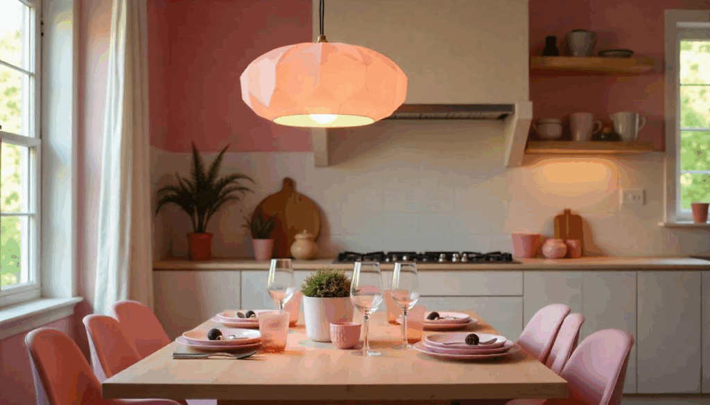
Pink glass pendant lights, rose quartz table lamps, or even pink lampshades can introduce color without overwhelming the space. Lighting is one of the easiest ways to experiment with pink before committing to larger elements.
I’m particularly fond of pink glass pendant lights over kitchen islands or dining tables—they create beautiful colored light that makes everyone look amazing during dinner parties. It’s functional design that also happens to be gorgeous.
29. Create Pink Built-in Seating
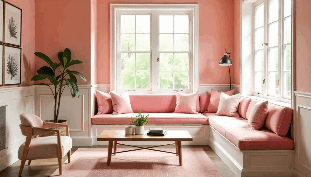
Built-in banquettes or window seats upholstered in pink fabric create permanent design elements that feel custom and expensive. This approach works particularly well in dining nooks, reading corners, or entryway areas.
The key is choosing durable, high-quality fabric since built-ins are harder to reupholster than moveable furniture. I recommend performance fabrics in pink tones—they look luxurious but can handle real family life.
30. Design a Pink Accent Wall with Architectural Detail
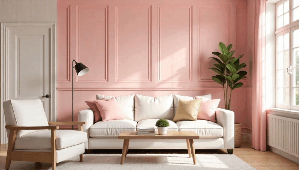
Instead of painting a flat accent wall pink, add architectural elements like board and batten, shiplap, or decorative molding first. The added dimension makes the pink feel more intentional and expensive while creating visual interest.
I recently installed vertical board and batten on a dining room accent wall before painting it dusty rose, and the result was absolutely stunning. The texture catches light differently throughout the day, making the pink color appear to shift and change naturally.